
Rewire is a magazine with articles written on a variety of topics meant to bring new insight to readers that may cause perspectives to shift.
Brand Identity
Editorial Design
Illustration
Photography
Rewire Magazine
The main audience is adults, male and female, from their late 20s to mid-40s, who have experienced many of life’s firsts as independent adults and can begin to think more critically on topics that affect their life on an individual and societal level. Perhaps this audience hasn’t found success in certain areas having followed mainstream advice or having spoken to their inner circle, so they’re looking for new perspectives. They’ll be able to find them in Rewire.
The secondary audience is those who are just entering adulthood and are experiencing independence for the first time. They’re interested in reading about what’s to come.
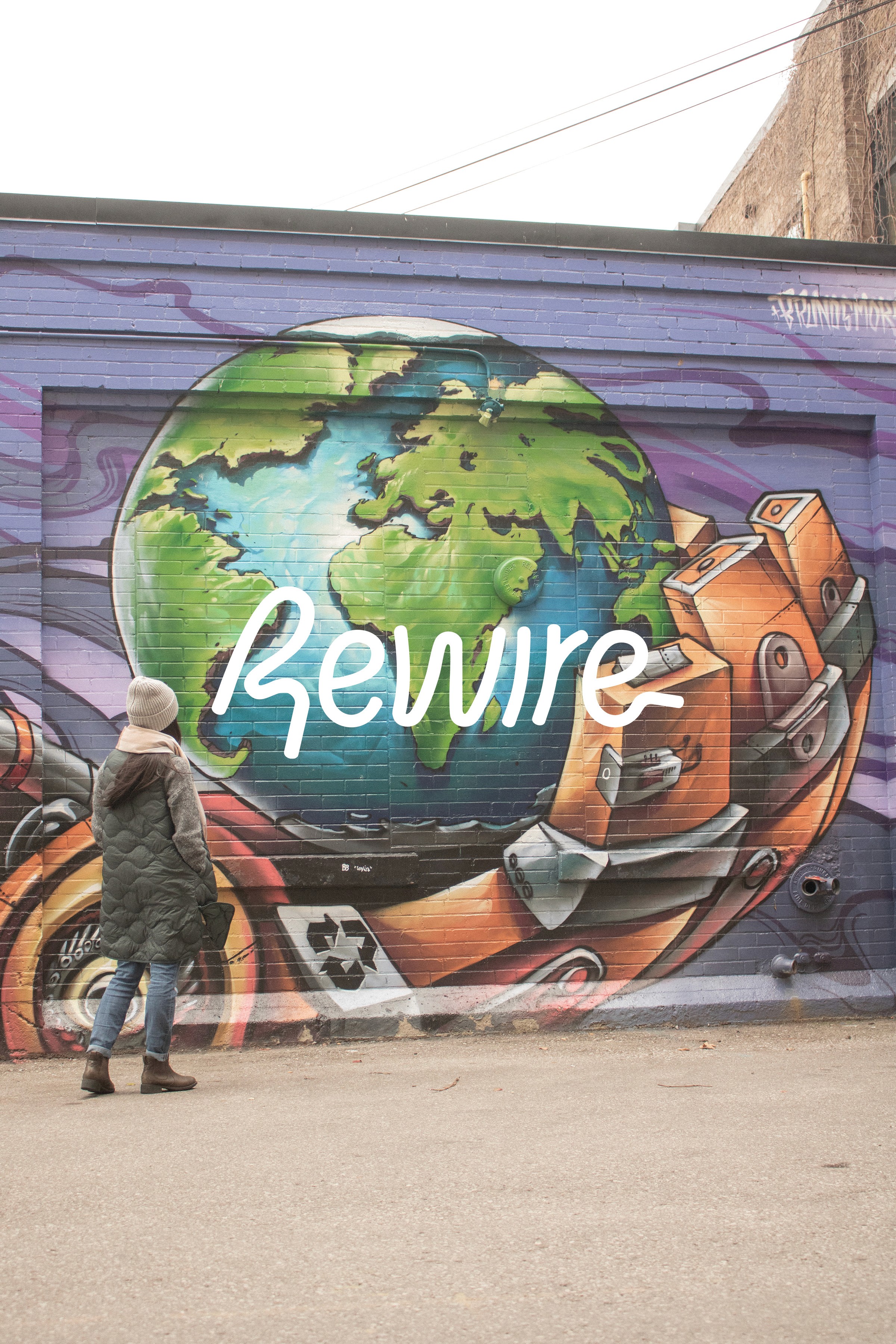
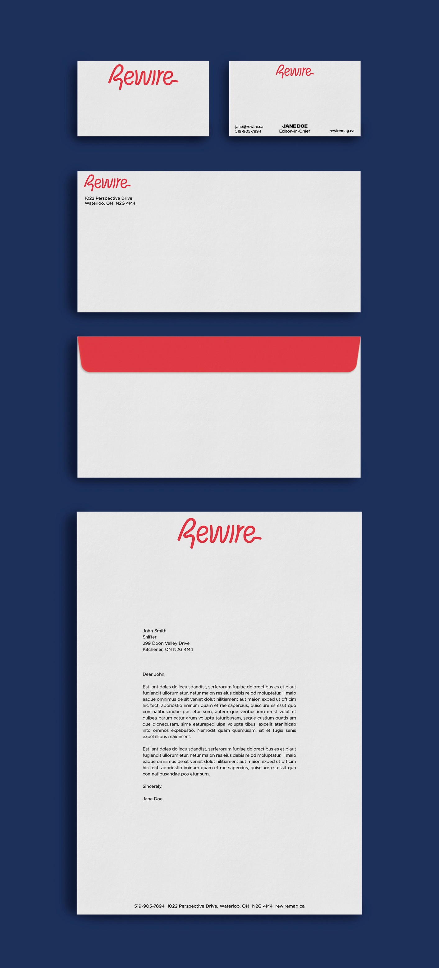
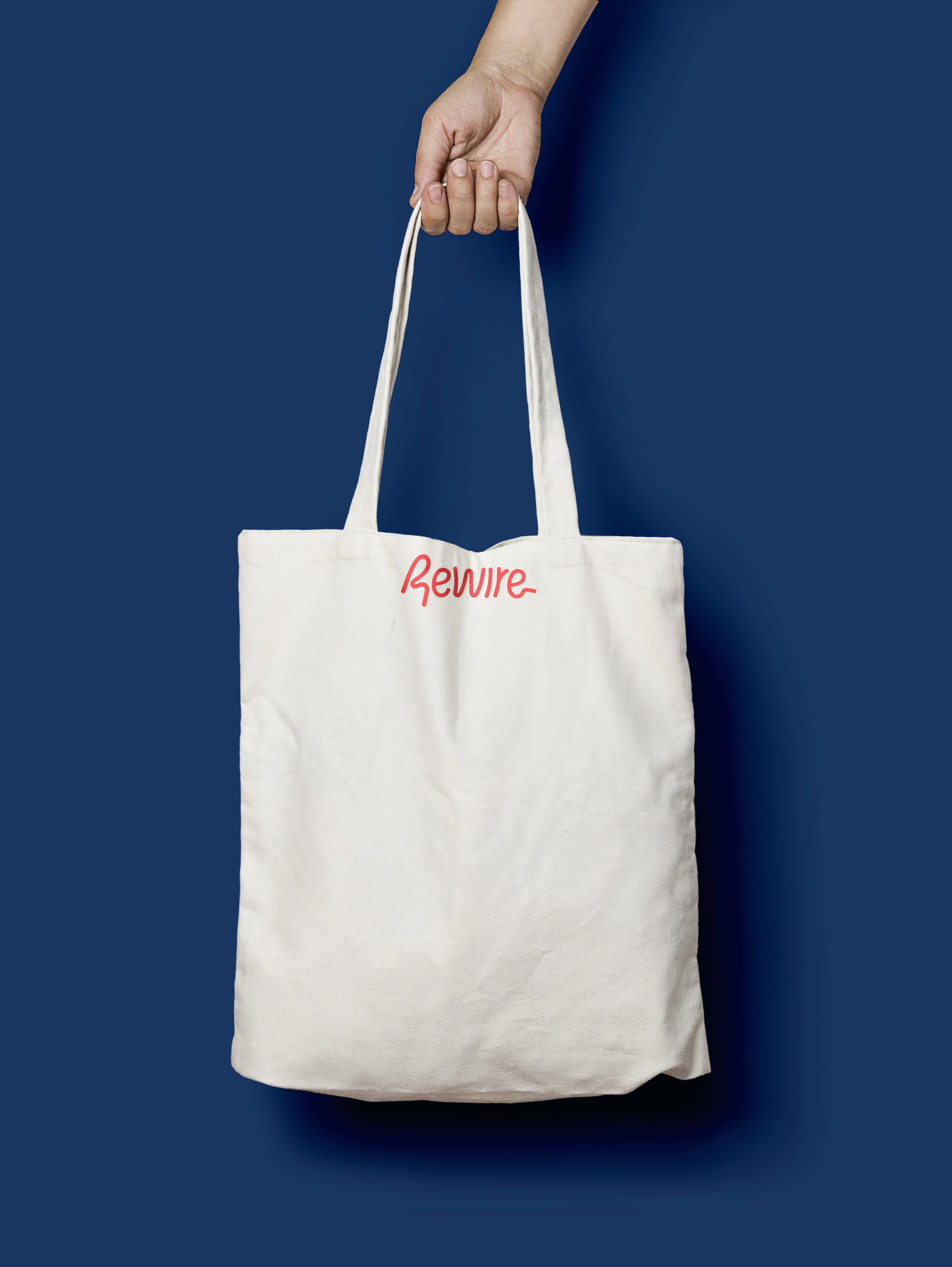
The brand identity for Rewire focused on the idea of how shifting perspectives rewires the brain. As new thoughts create new neural networks, these networks can be thought of as malleable, like wire. The wordmark is based on the typeface, Habanero; however, each letter has been customized. The main colour of red subconsciously connects readers to trusted writing, as many competitors use red in their logo. With its curved corners, the logo feels welcoming and should resonate with the target audience.
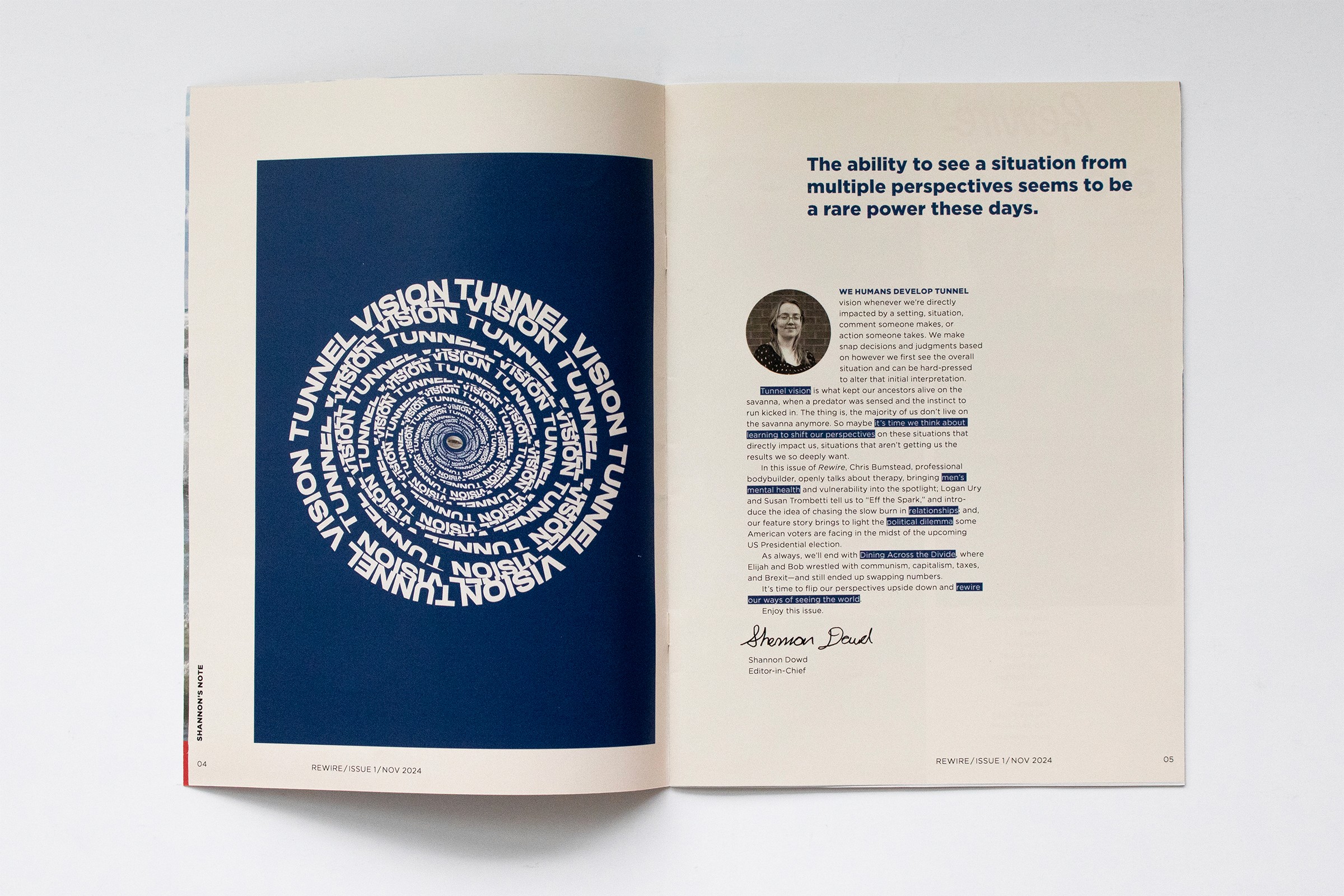
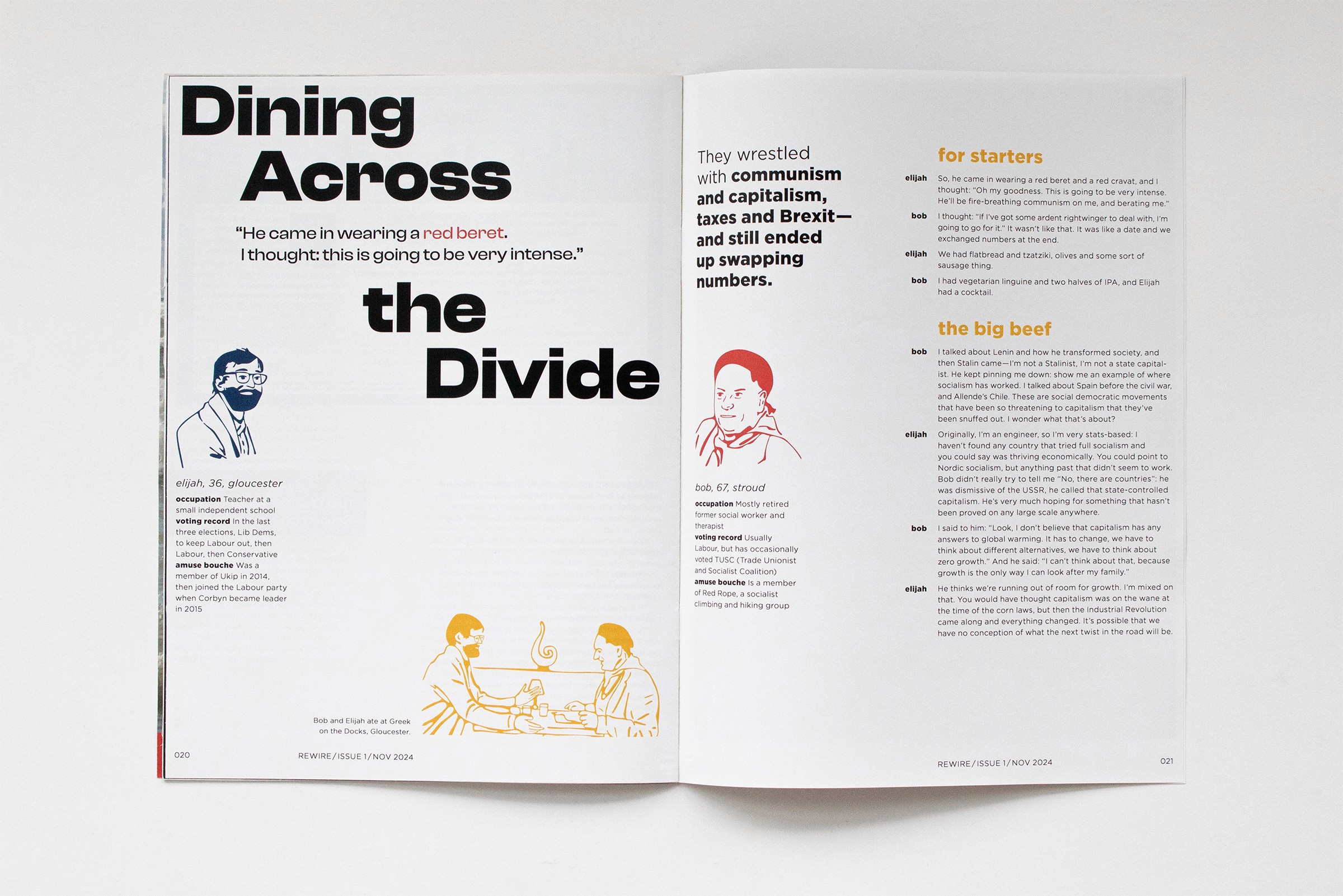
Designing content close to edges with very narrow margins was intentional. Shifting perspectives causes us to push the limits of what we’ve been taught. We go closer to the edges, away from mainstream thinking—from one opinion to another—often on the opposite end of the spectrum.
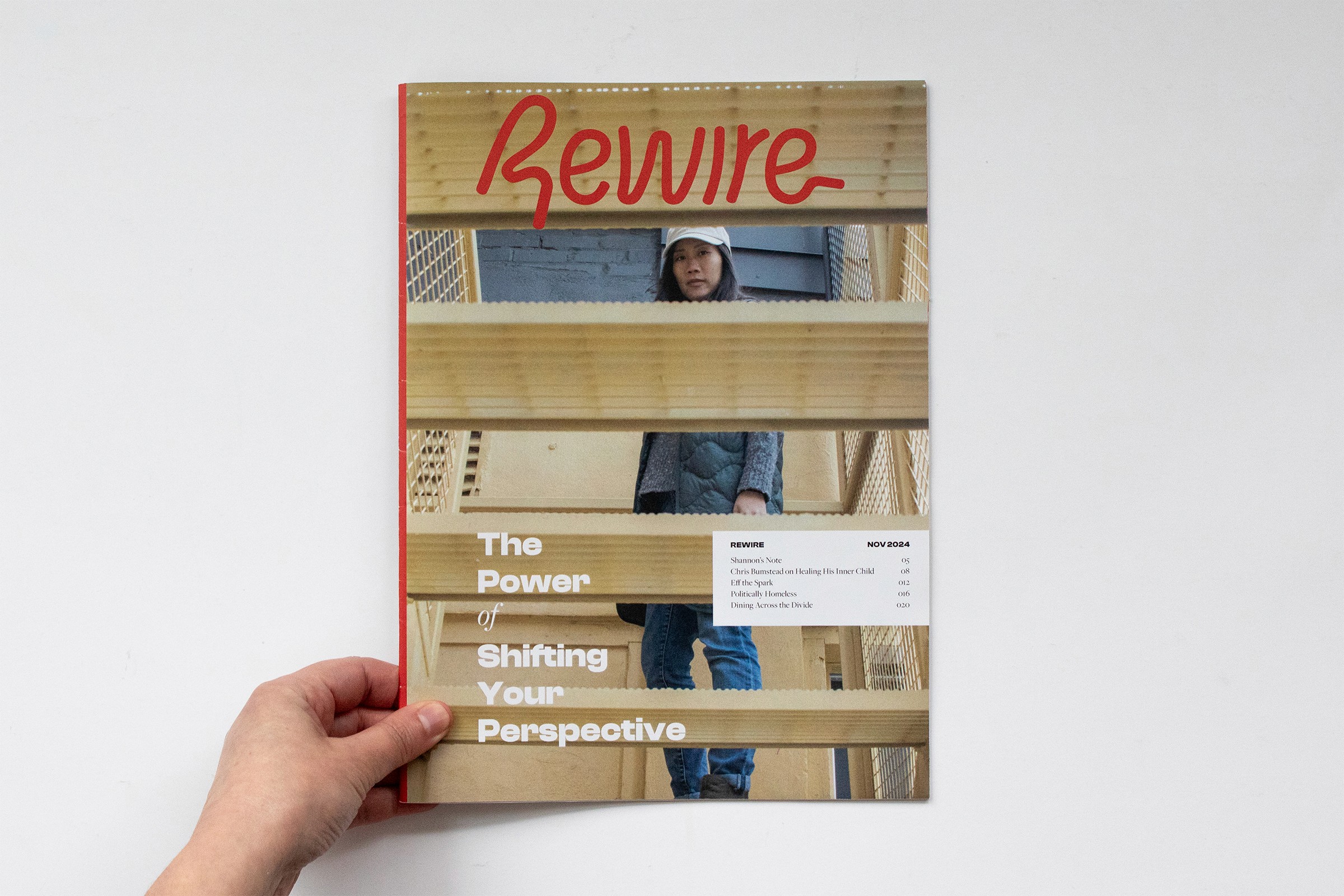
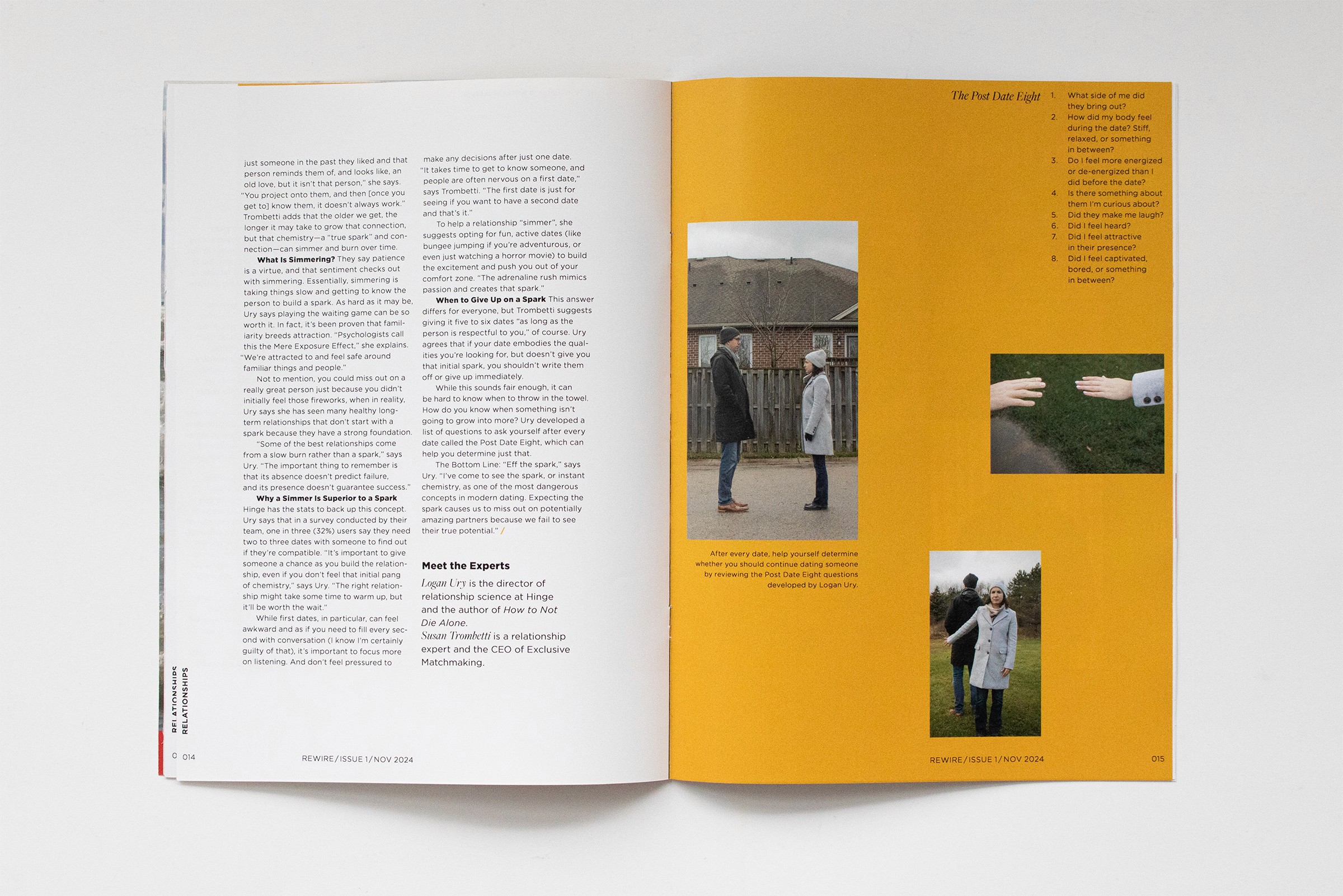
Readers come to the magazine when they’re at a crossroads, and the photo editing style of midtone colours addresses the serious nature of the articles. The magazine isn’t bright and doesn’t promise positive outcomes—it won’t solve anyone’s problems—yet it’s not dark and depressing. It’s thought-provoking, brave, and based in reality. That’s why no one in the photos is smiling.
The cover photo is attention-grabbing: looking at the camera through the stairs, seeing things from a new angle, the woman photographed embodies the courage it takes to look oneself in the mirror and be open to new perspectives.
Rewire is a magazine with articles written on a variety of topics meant to bring new insight to readers that may cause perspectives to shift.
Brand Identity
Editorial Design
Illustration
Photography
Rewire Magazine
The main audience is adults, male and female, from their late 20s to mid-40s, who have experienced many of life’s firsts as independent adults and can begin to think more critically on topics that affect their life on an individual and societal level. Perhaps this audience hasn’t found success in certain areas having followed mainstream advice or having spoken to their inner circle, so they’re looking for new perspectives. They’ll be able to find them in Rewire.
The secondary audience is those who are just entering adulthood and are experiencing independence for the first time. They’re interested in reading about what’s to come.
The brand identity for Rewire focused on the idea of how shifting perspectives rewires the brain. As new thoughts create new neural networks, these networks can be thought of as malleable, like wire. The wordmark is based on the typeface, Habanero; however, each letter has been customized. The main colour of red subconsciously connects readers to trusted writing, as many competitors use red in their logo. With its curved corners, the logo feels welcoming and should resonate with the target audience.
Designing content close to edges with very narrow margins was intentional. Shifting perspectives causes us to push the limits of what we’ve been taught. We go closer to the edges, away from mainstream thinking—from one opinion to another—often on the opposite end of the spectrum.
Readers come to the magazine when they’re at a crossroads, and the photo editing style of midtone colours addresses the serious nature of the articles. The magazine isn’t bright and doesn’t promise positive outcomes—it won’t solve anyone’s problems—yet it’s not dark and depressing. It’s thought-provoking, brave, and based in reality. That’s why no one in the photos is smiling.
The cover photo is attention-grabbing: looking at the camera through the stairs, seeing things from a new angle, the woman photographed embodies the courage it takes to look oneself in the mirror and be open to new perspectives.

Explore More

Explore More


Explore More