

Teaching elementary and middle school students about nuclear power, safety, and science.
Logo Design
Bruce Power Visitors' Centre Educational Programs: Nuclear Navigators and Power Pals
Designed for the Bruce Power Visitors' Centre
Bruce Power is North America’s largest nuclear power plant. Its Visitors’ Centre provides nuclear educational programming to school groups. The Nuclear Navigators program is for grades 5–8 (ages 8–13), and the Power Pals program is for kindergarten to grade 4.
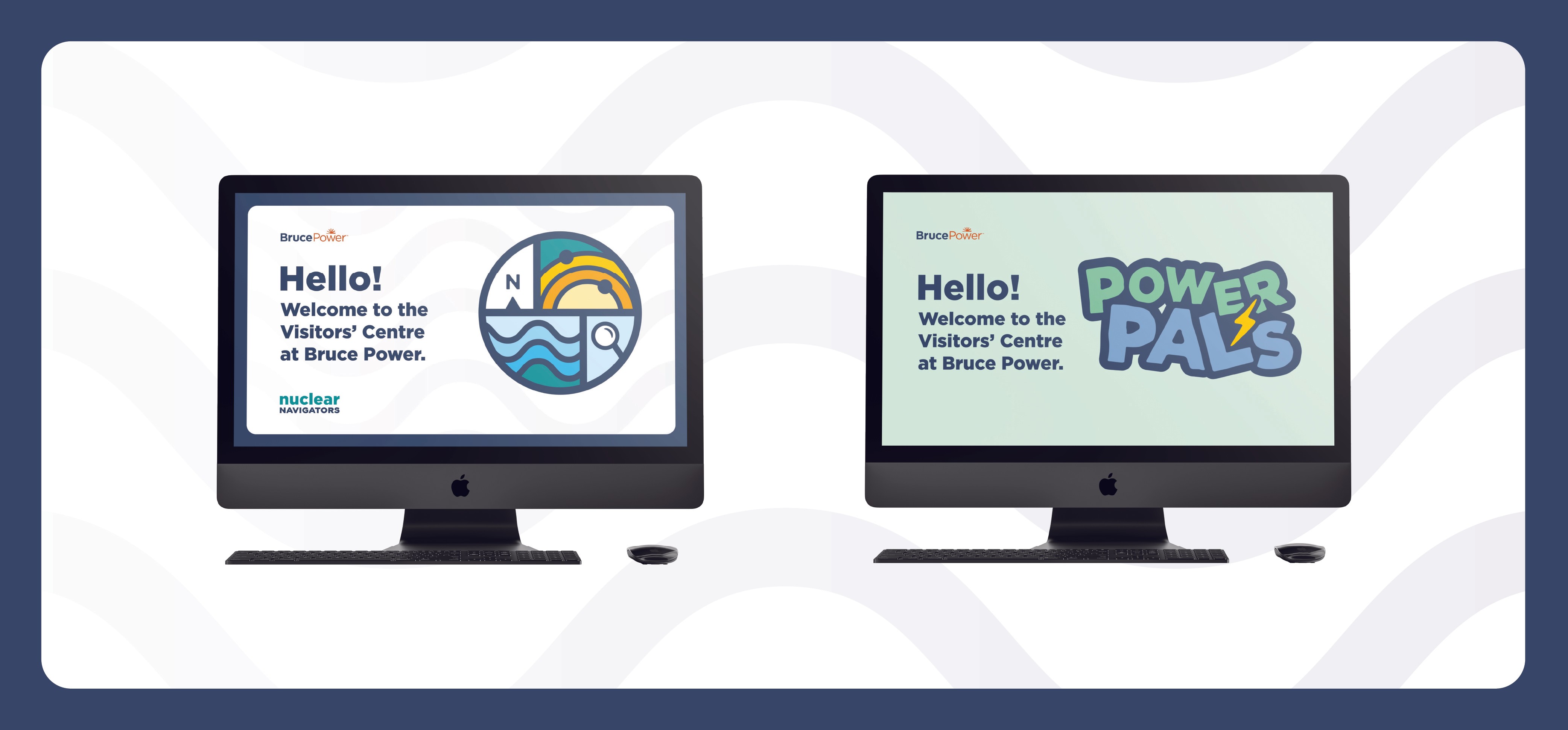
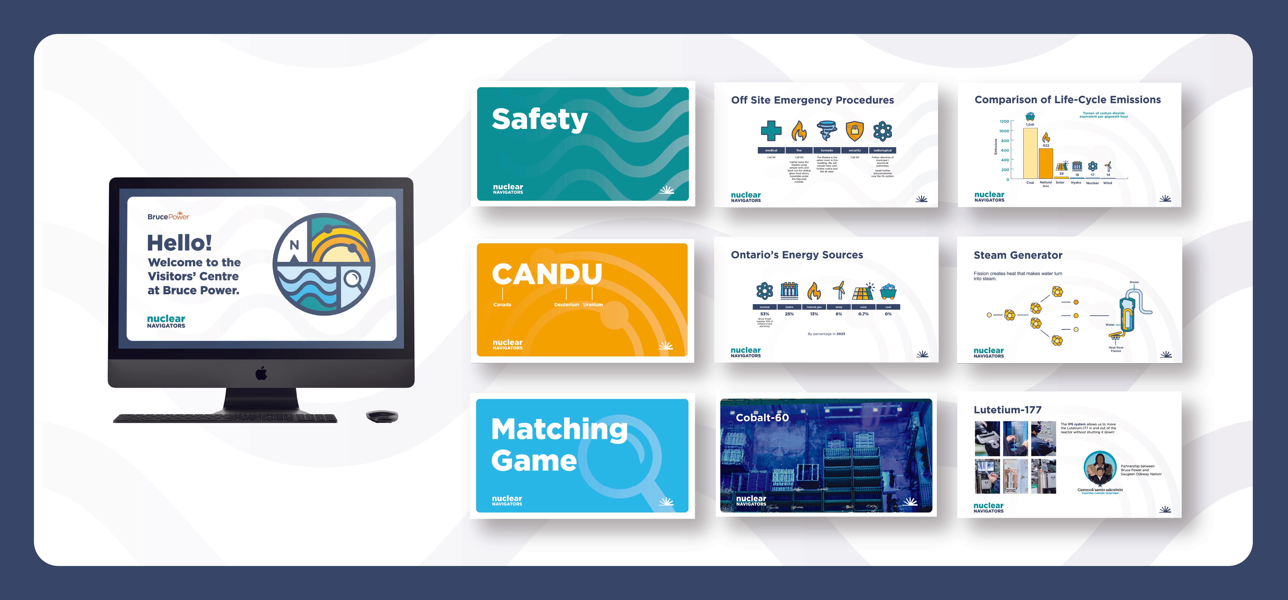
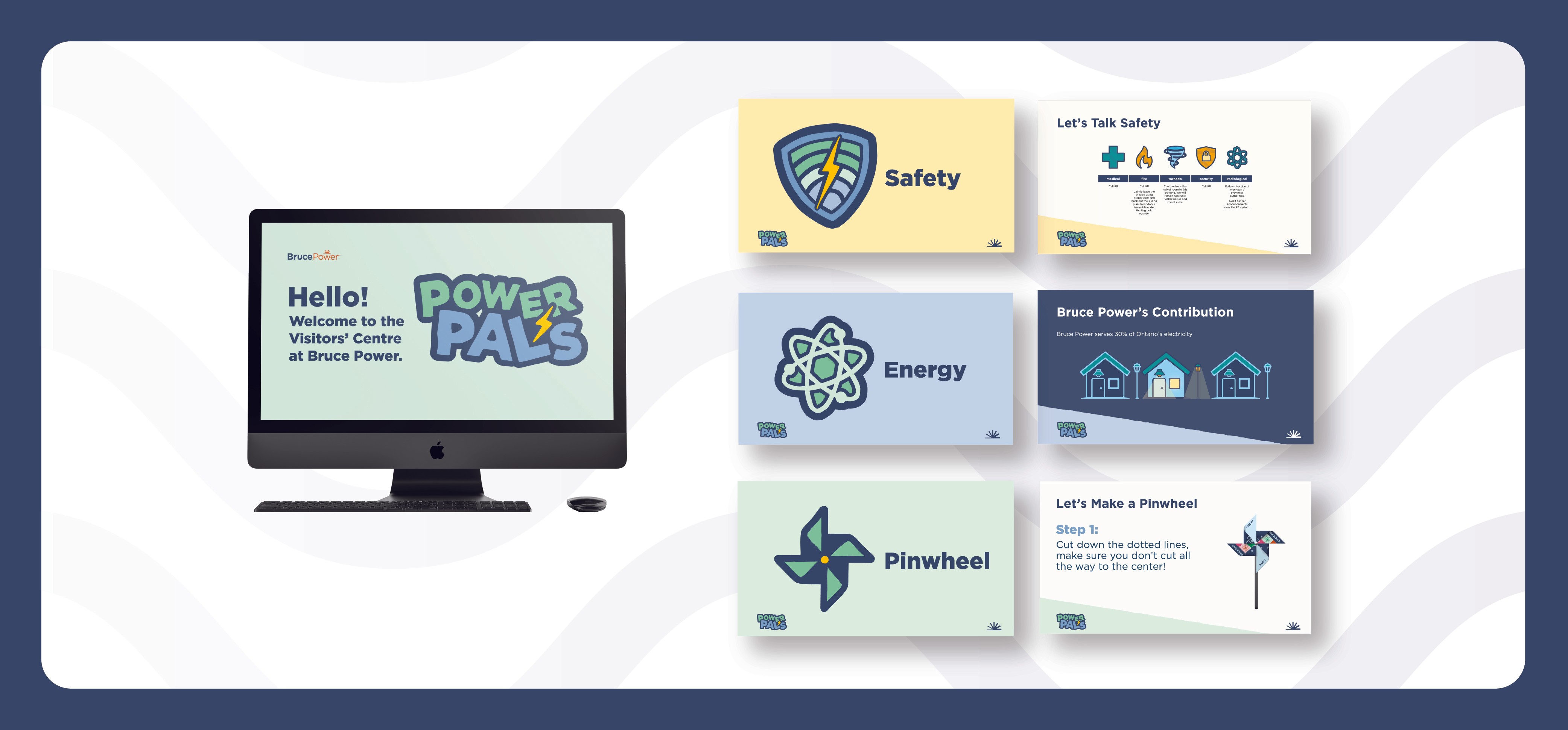
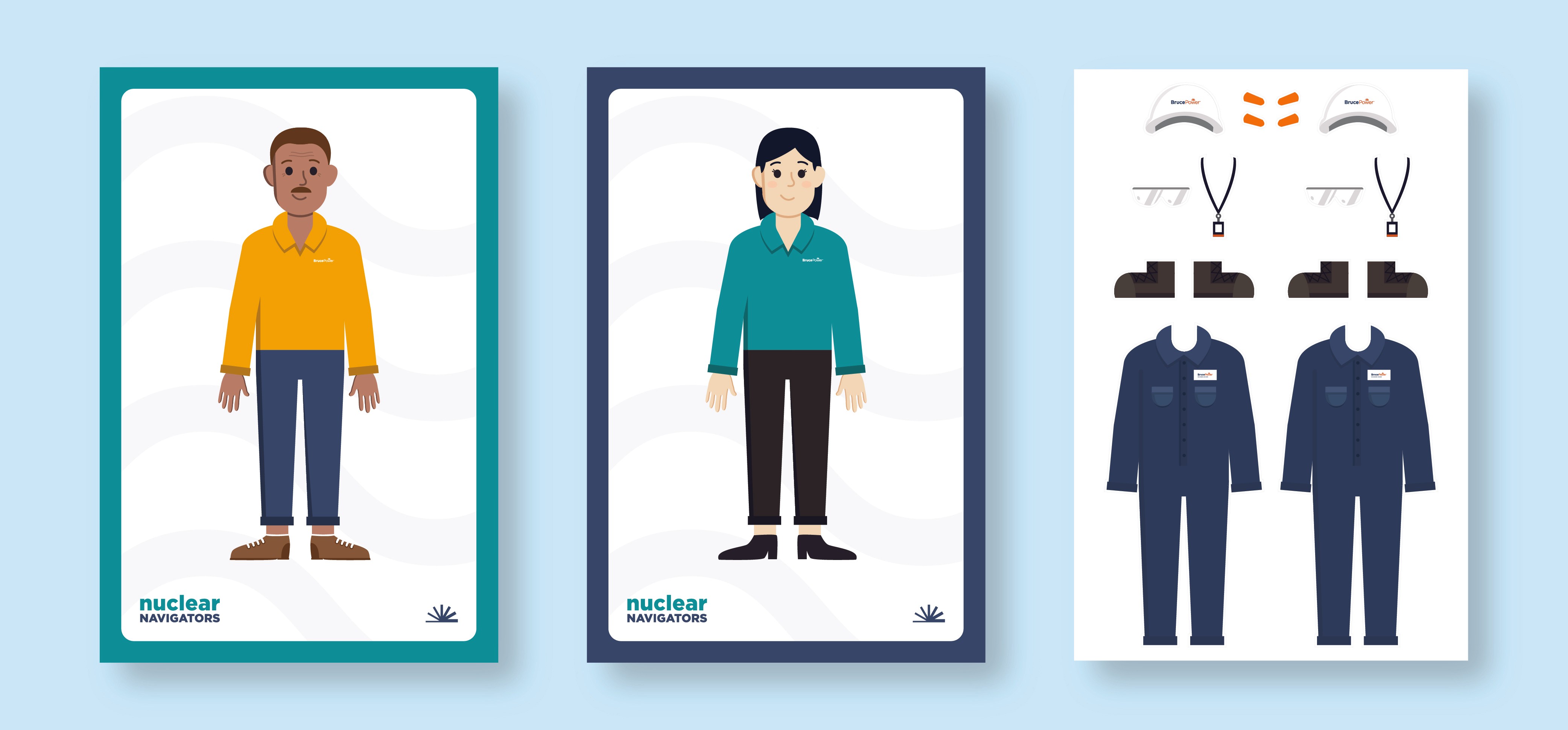
This project’s objectives were to design two logos—one for each program—while staying consistent with Bruce Power’s brand standards. The logos needed to be age-appropriate and cohesive, and used in slideshow presentations and various activities including a matching card game showing the steps of nuclear power production and a “pin-the-safety-equipment-on-the-employee” activity.
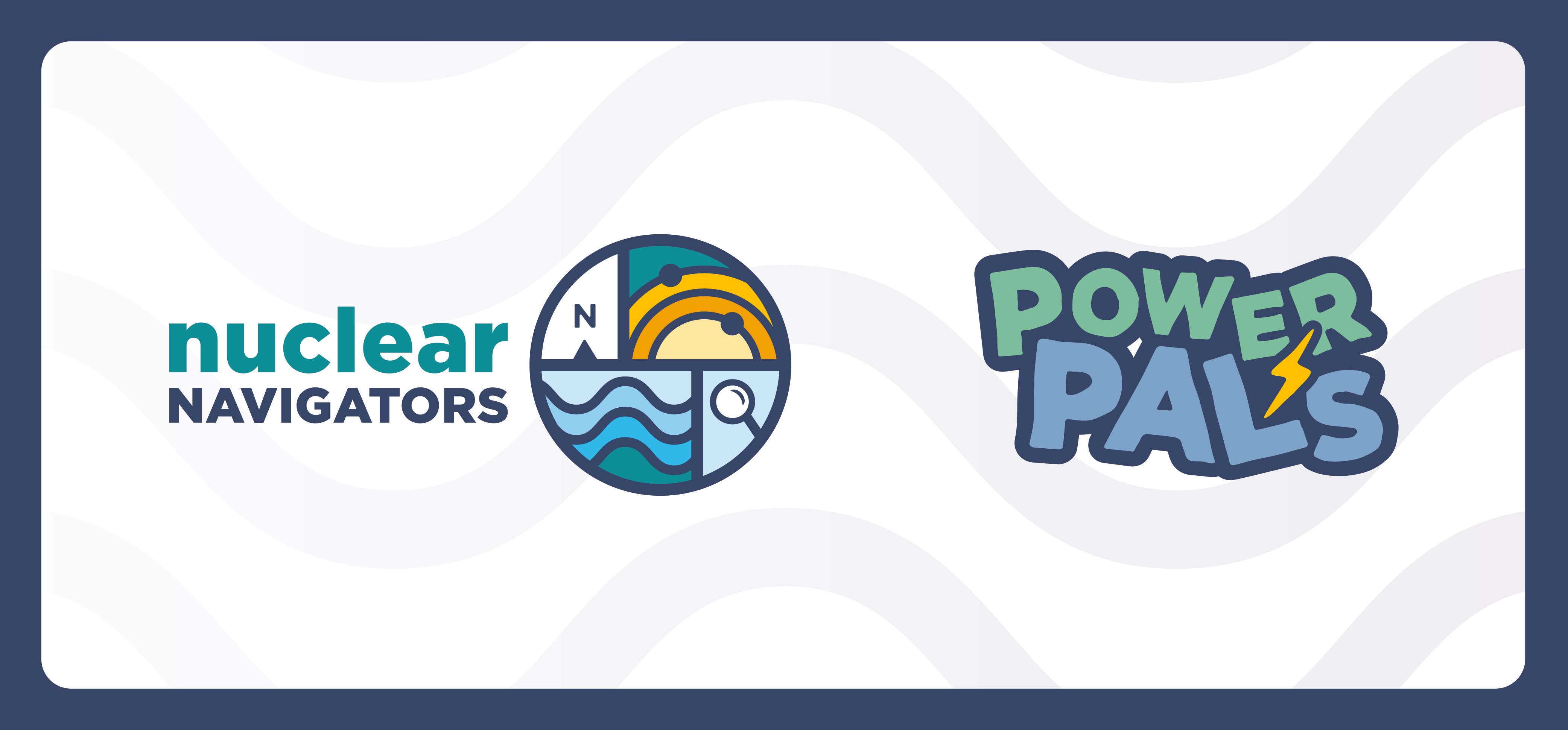
When designing the logo for Nuclear Navigators, the key themes of nuclear, safety, science, navigation and curiosity were considered. In addition to the design decisions outlined below, a patch was designed (see the matching game), which ties this program to education and achievement, like in Guides and Scouts. The slideshow and activities contain a border that simulates the content being displayed on a phone screen, further connecting to the program’s audience.
When designing the logo for Power Pals, the key themes of nuclear being clean and keeping the Earth happy, with Bruce Power being a fun, safe place to visit were considered. Overall, the logo has a clean look and feel, and Earth’s main colours of blue and green are used. Nuclear energy is shown through the clear, obvious connection of energy to a lightning bolt, as well as the subtle wave in which the letters are positioned. The logo, with a hand-drawn look, is also playful and fun, which should resonate with the young Power Pals audience. Safety is emphasized by the solid, powerful navy-blue background that keeps everything together—no element is on its own.
Teaching elementary and middle school students about nuclear power, safety, and science.
Logo Design
Bruce Power Visitors' Centre Educational Programs: Nuclear Navigators and Power Pals
Designed for the Bruce Power Visitors' Centre
Bruce Power is North America’s largest nuclear power plant. Its Visitors’ Centre provides nuclear educational programming to school groups. The Nuclear Navigators program is for grades 5–8 (ages 8–13), and the Power Pals program is for kindergarten to grade 4.
This project’s objectives were to design two logos—one for each program—while staying consistent with Bruce Power’s brand standards. The logos needed to be age-appropriate and cohesive, and used in slideshow presentations and various activities including a matching card game showing the steps of nuclear power production and a “pin-the-safety-equipment-on-the-employee” activity.
When designing the logo for Nuclear Navigators, the key themes of nuclear, safety, science, navigation and curiosity were considered. In addition to the design decisions outlined below, a patch was designed (see the matching game), which ties this program to education and achievement, like in Guides and Scouts. The slideshow and activities contain a border that simulates the content being displayed on a phone screen, further connecting to the program’s audience.
When designing the logo for Power Pals, the key themes of nuclear being clean and keeping the Earth happy, with Bruce Power being a fun, safe place to visit were considered. Overall, the logo has a clean look and feel, and Earth’s main colours of blue and green are used. Nuclear energy is shown through the clear, obvious connection of energy to a lightning bolt, as well as the subtle wave in which the letters are positioned. The logo, with a hand-drawn look, is also playful and fun, which should resonate with the young Power Pals audience. Safety is emphasized by the solid, powerful navy-blue background that keeps everything together—no element is on its own.

Explore More


Explore More


Explore More
