In the heart of Kitchener/Waterloo, this is campfire cooking redefined.
Brand Identity
Packaging
UX/UI Design
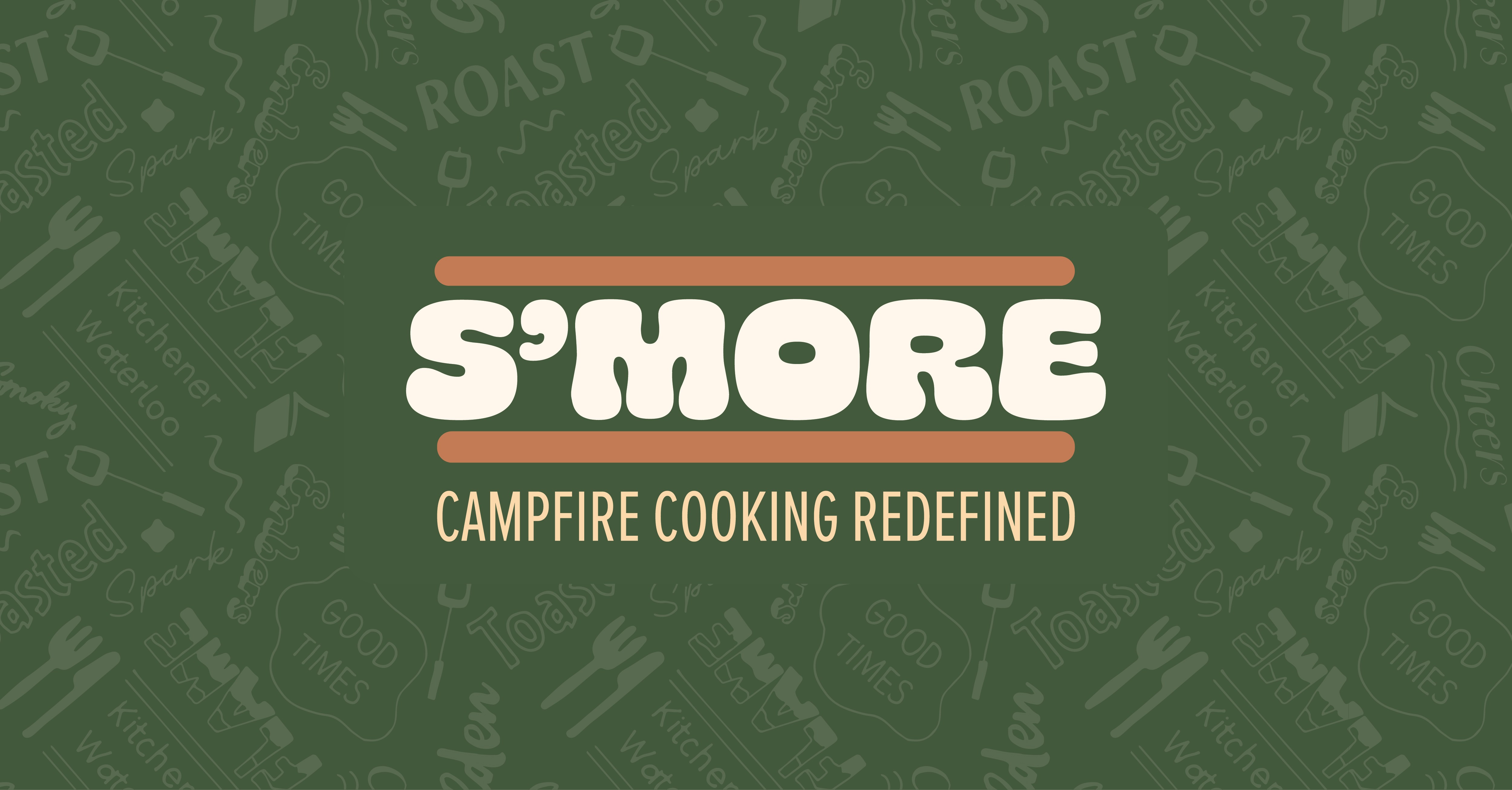
S'MORE
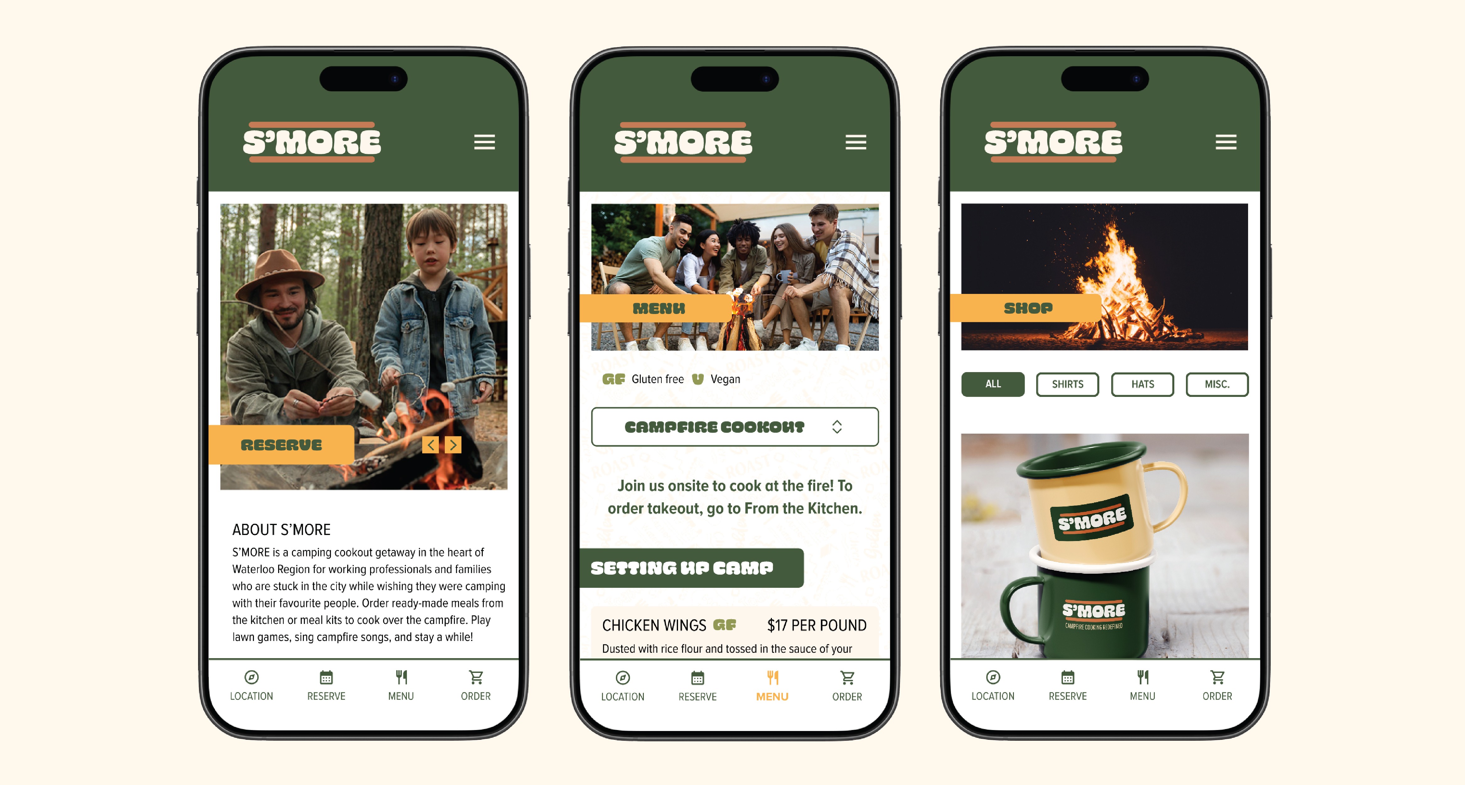
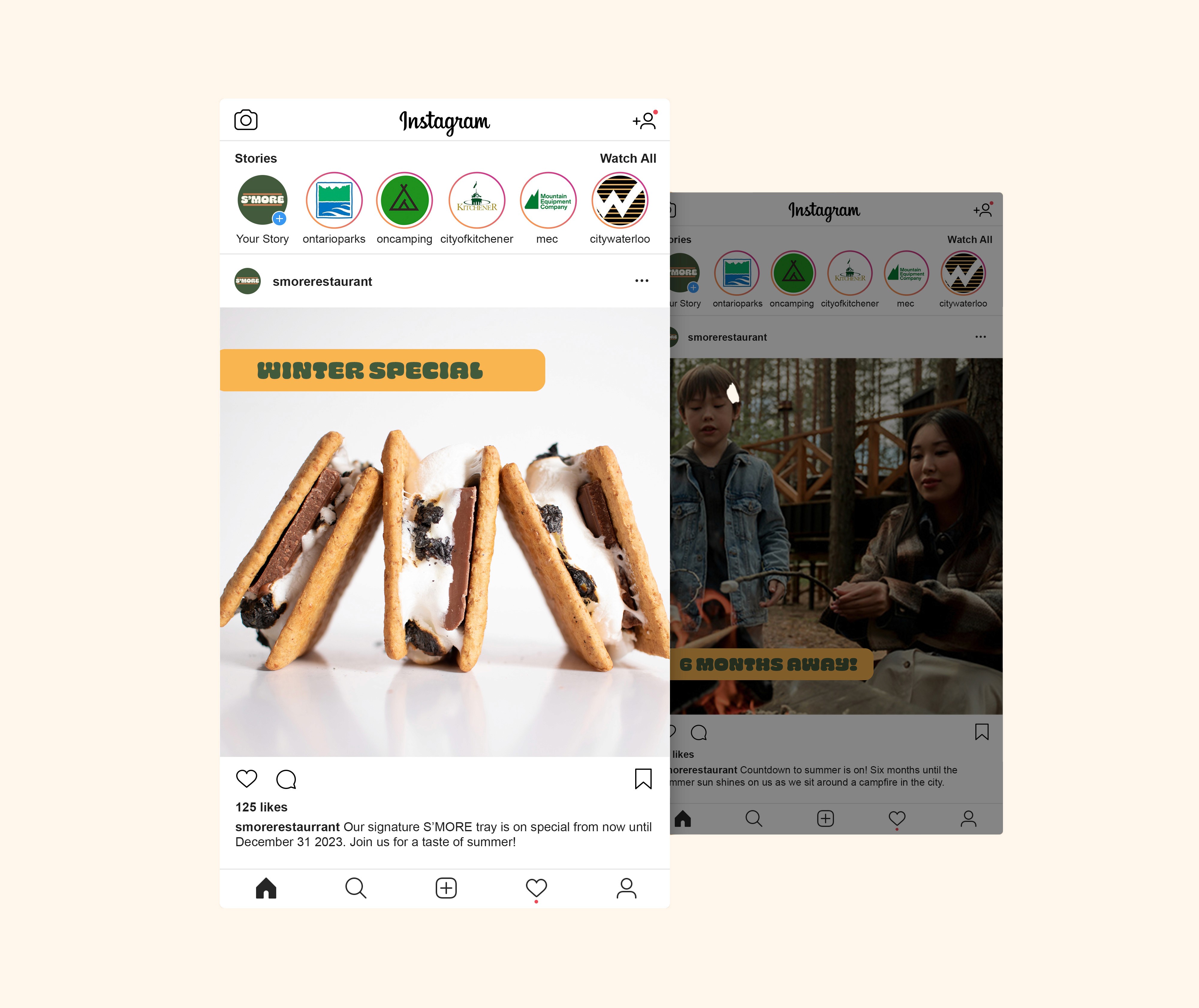
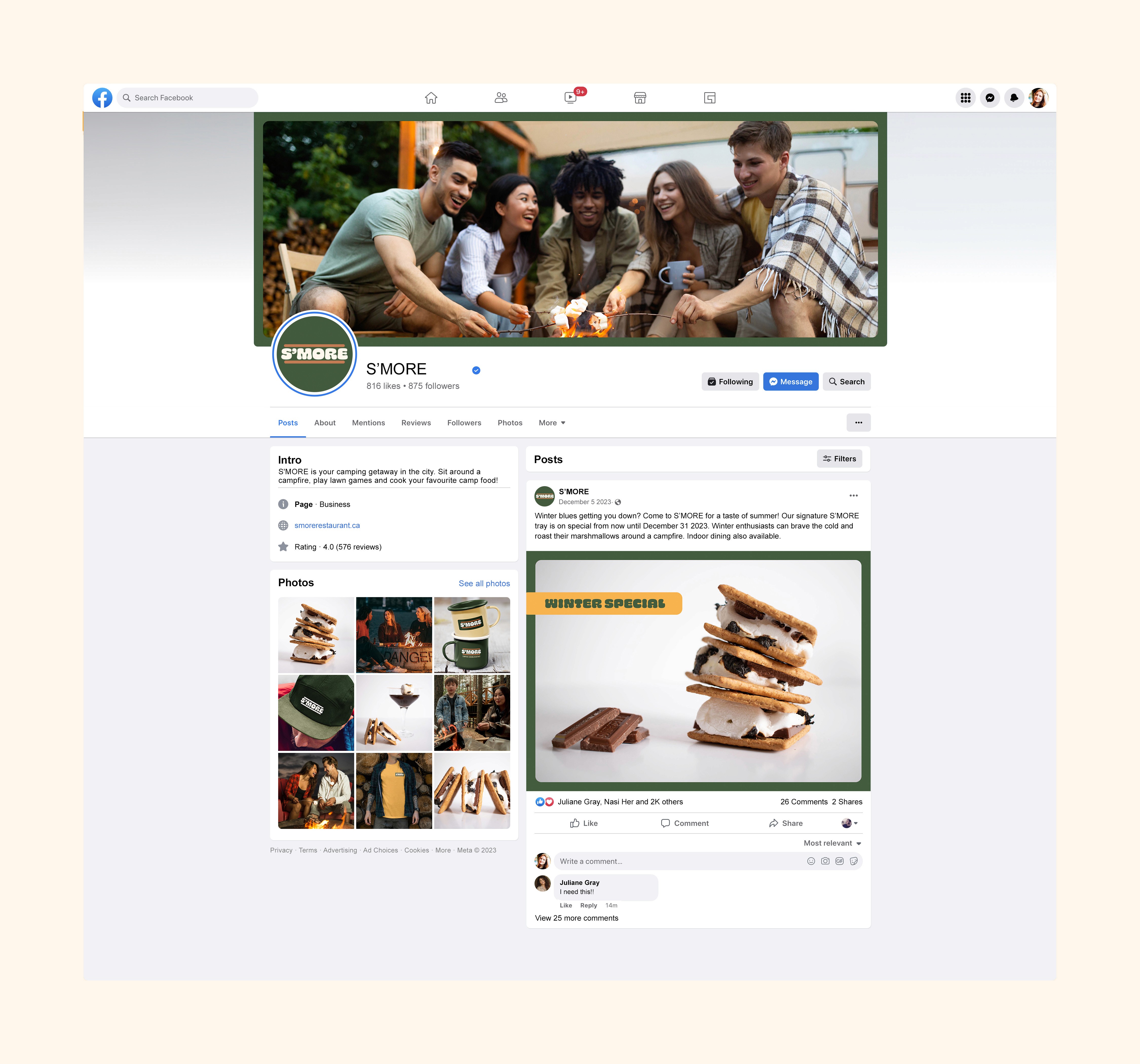
S’MORE is a fictional camping cookout experience in the heart of Waterloo Region for working professionals and families who are stuck in the city while wishing they were camping with their favourite people. Customers can order from the kitchen or cook over a campfire while drinking and playing lawn games.
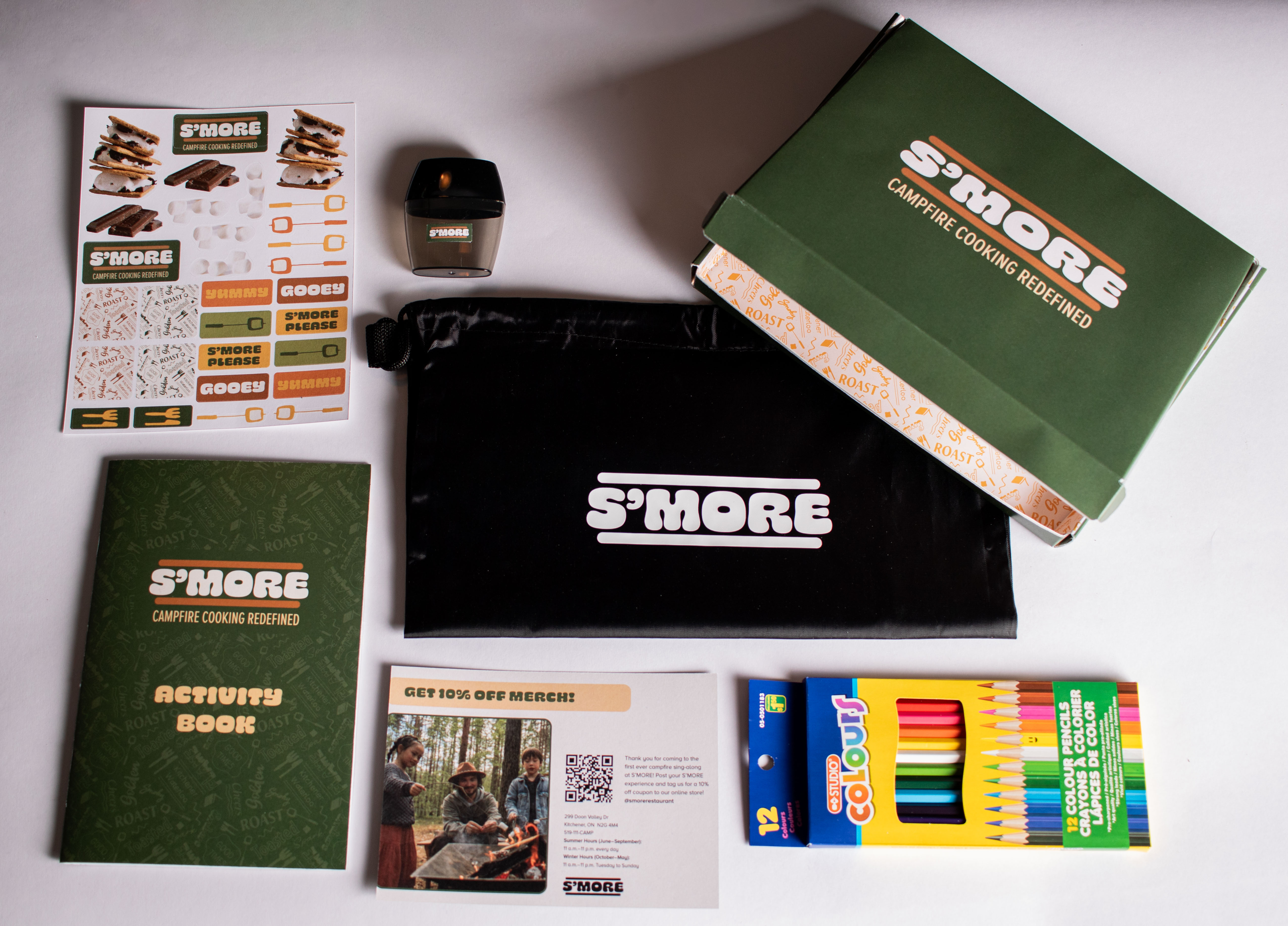
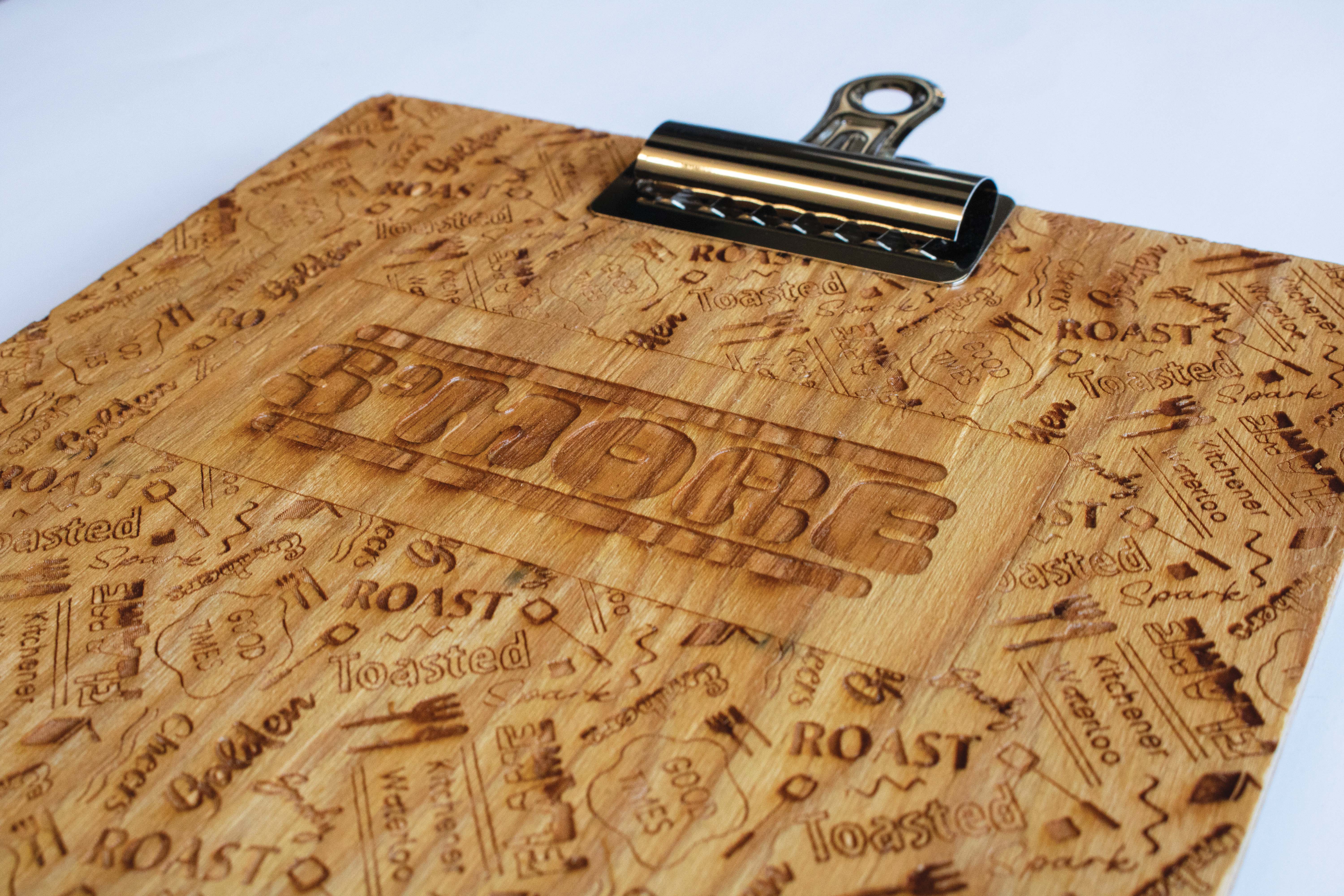
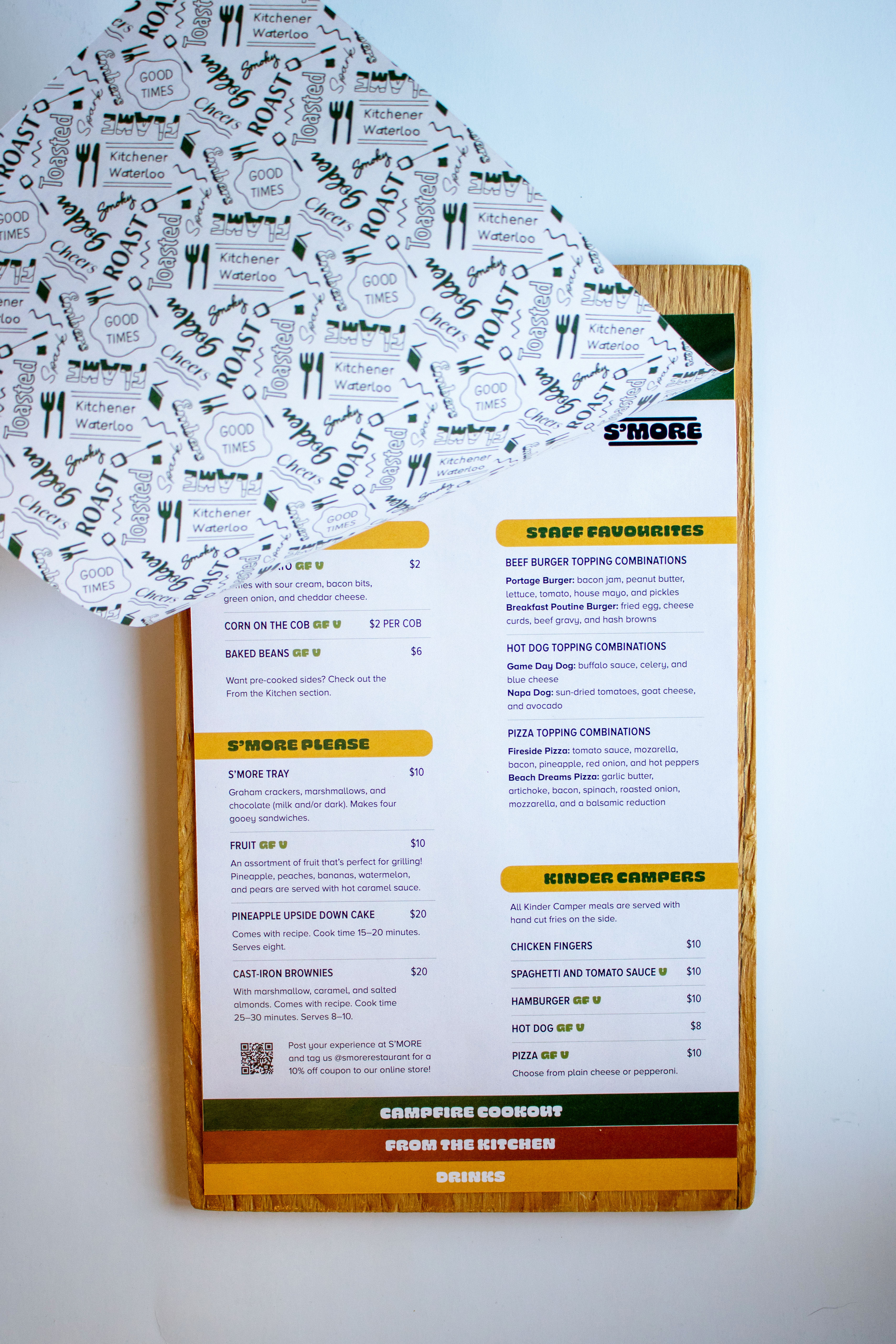
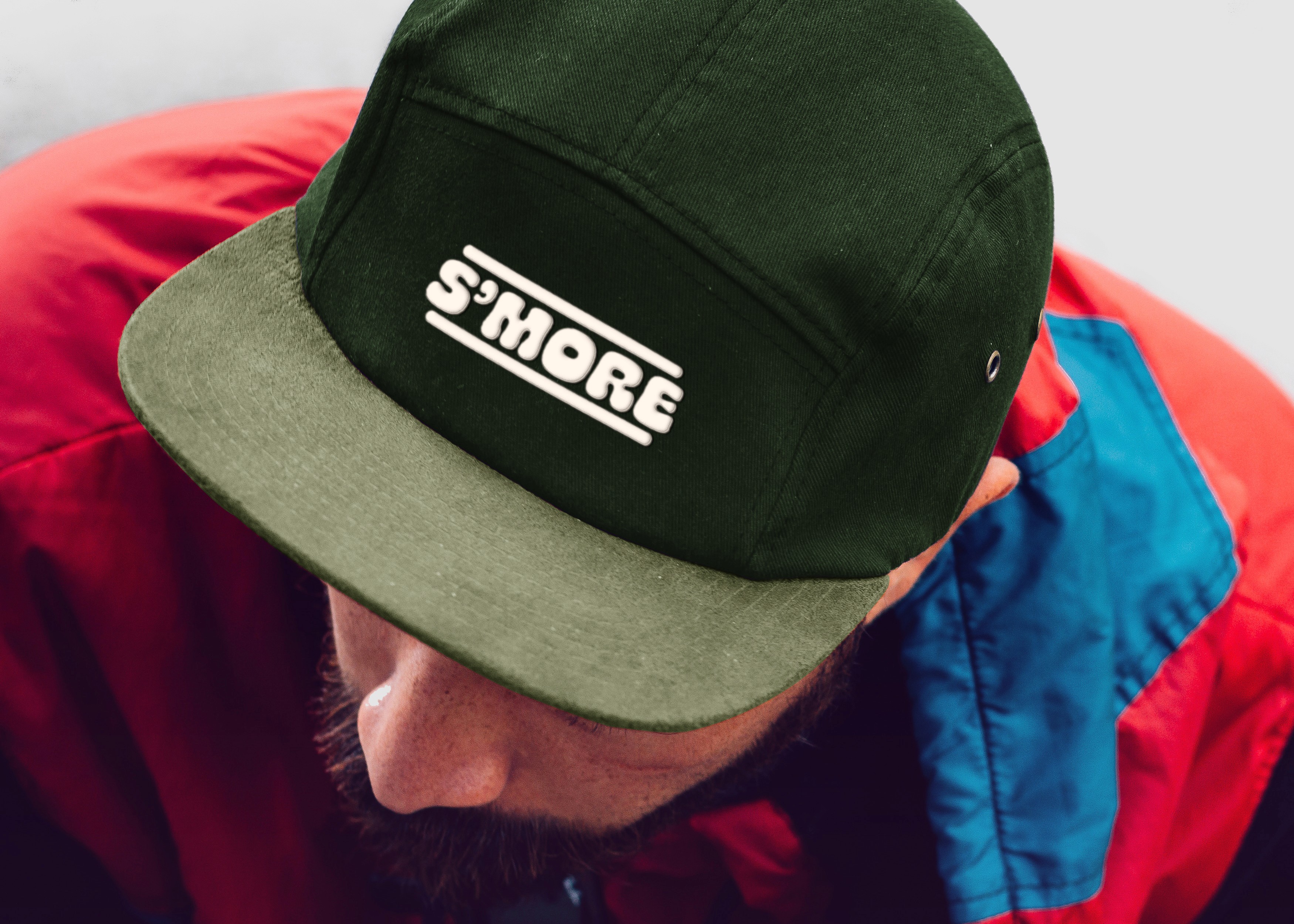
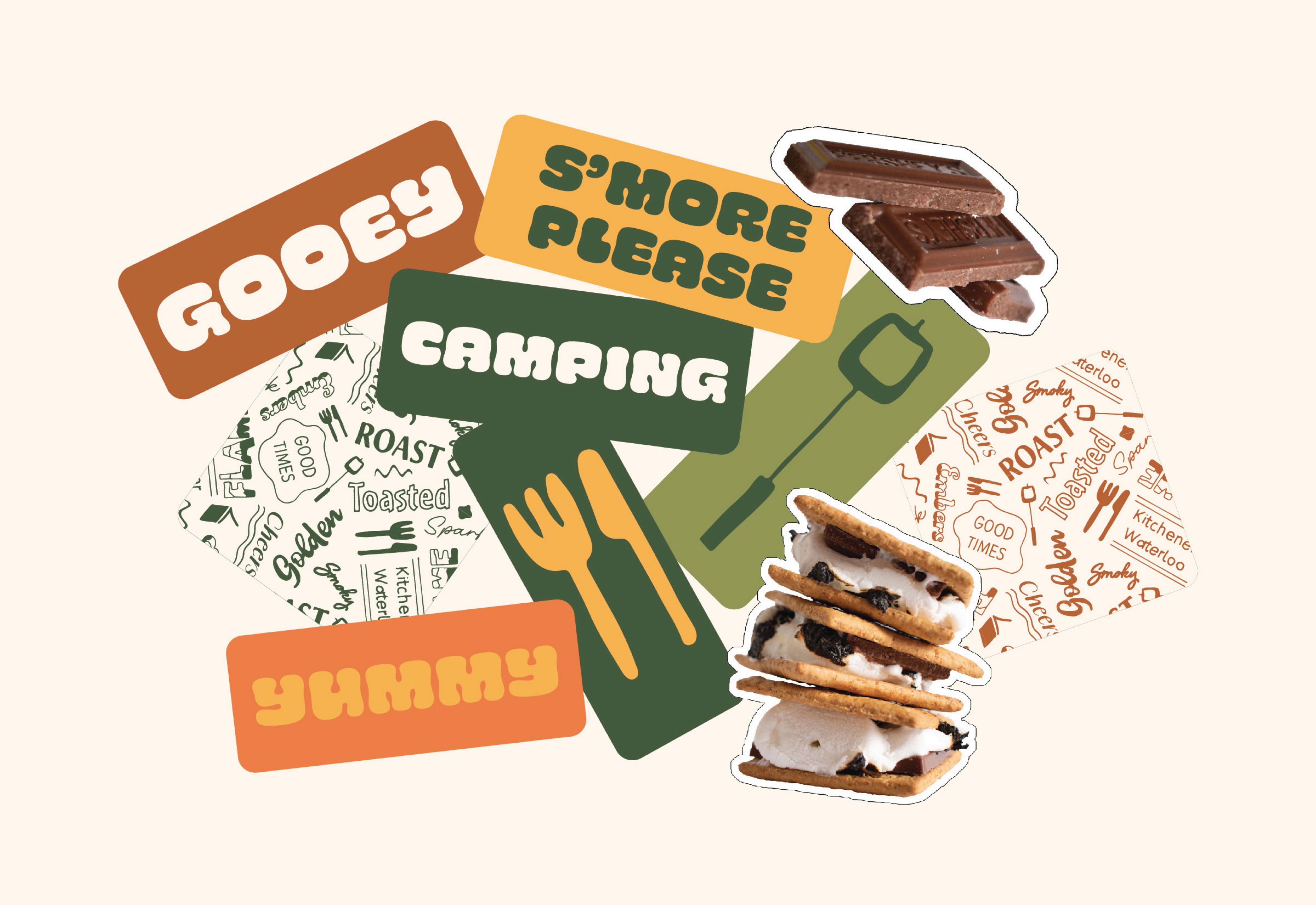
Every decision for S’MORE reflects the feel-good, playful, summer loving, and inviting qualities of the brand. The logo was designed to mimic a gooey s’more, a nostalgic sandwich that brings people together around a campfire. Each element’s design is consistent with the look and feel of the typography, colours, and visual elements. Note the desaturated colour palette (adds a rustic / outdoorsy feel); the real-life laser engraved wooden clipboard menu; the hand-drawn playful pattern; and, the promotional package, an activity kit for children.
In the heart of Kitchener/Waterloo, this is campfire cooking redefined.
Brand Identity
Packaging
UX/UI Design
S'MORE
S’MORE is a fictional camping cookout experience in the heart of Waterloo Region for working professionals and families who are stuck in the city while wishing they were camping with their favourite people. Customers can order from the kitchen or cook over a campfire while drinking and playing lawn games.
Every decision for S’MORE reflects the feel-good, playful, summer loving, and inviting qualities of the brand. The logo was designed to mimic a gooey s’more, a nostalgic sandwich that brings people together around a campfire. Each element’s design is consistent with the look and feel of the typography, colours, and visual elements. Note the desaturated colour palette (adds a rustic / outdoorsy feel); the real-life laser engraved wooden clipboard menu; the hand-drawn playful pattern; and, the promotional package, an activity kit for children.
In the heart of Kitchener/Waterloo, this is campfire cooking redefined.
Packaging
UX/UI Design
Brand Identity
S'MORE
S’MORE is a fictional camping cookout experience in the heart of Waterloo Region for working professionals and families who are stuck in the city while wishing they were camping with their favourite people. Customers can order from the kitchen or cook over a campfire while drinking and playing lawn games.
Every decision for S’MORE reflects the feel-good, playful, summer loving, and inviting qualities of the brand. The logo was designed to mimic a gooey s’more, a nostalgic sandwich that brings people together around a campfire. Each element’s design is consistent with the look and feel of the typography, colours, and visual elements. Note the desaturated colour palette (adds a rustic / outdoorsy feel); the real-life laser engraved wooden clipboard menu; the hand-drawn playful pattern; and, the promotional package, an activity kit for children.


Explore More


Explore More

Explore More